This is the kind of written review an audit or a diagnostic gives you: what's wrong, why it matters, and what fixes it, worst first.
CriticalThe browser set the price
The checkout sent its own total to the server, and the server believed it. I edited one number in the request and ordered the €42 celebration cake for €0.01. The order went through.
// server: creating an order
- const total = req.body.total;          // whatever the browser says
+ const total = priceFromMenu(req.body.items); // the server's own prices
The server prices every order from its own product list and ignores any total sent by the browser. The same €0.01 order is now charged €42.
CriticalOrder links showed other customers' details
Order pages lived at addresses like /order/1042. Change the number to 1041 and you saw someone else's name, phone number and order. Anyone could read every customer this way.
Each order gets a random, unguessable 22-character link. The old numbered links now return "not found".
HighPickup times in the wrong time zone
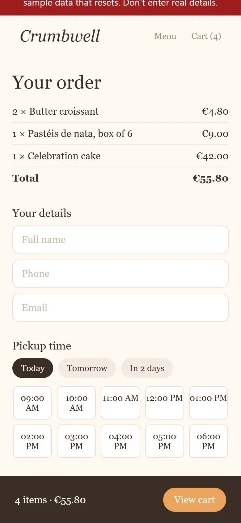
Pickup slots were built in UTC, not Lisbon time, then shown in the customer's own time zone. From late March to late October the list ran an hour late: 9:00 to 18:00 instead of 8:00 to 17:00, so the bakery offered a pickup after it had closed. A customer abroad saw different times again.
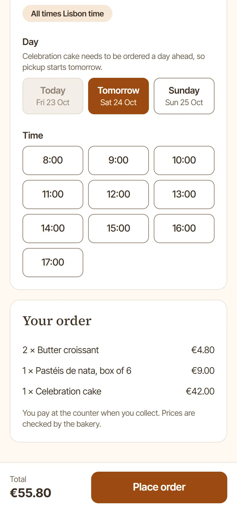
Slots are built in Europe/Lisbon time, labelled "All times Lisbon time", with tests across both clock changes.
HighA checkout keyboard and screen-reader users couldn't finish
The pickup-time picker was a grid of clickable boxes a keyboard can't reach. Fields had only faint placeholders instead of labels, errors were shown only in red, the order button had 2.1:1 contrast and the grey text 2.3:1. The menu photos had no descriptions and the page didn't declare its language. That's lost orders, and a legal risk under the European Accessibility Act.
The checkout was redesigned in Penpot first, then built to match: real radio buttons for day and time, a label on every field, errors in words, and colours that pass WCAG 2.2 AA. axe-core now finds 0 issues on the menu and the checkout.
HighPlace order hidden on phones
The "View cart" bar stayed fixed at the bottom of the screen on the checkout page too, right where the Place order button was. On a phone you couldn't see the button at all.
No cart bar on checkout. The total and Place order stay visible at the bottom, checked by an automated phone test at every scroll position.
Full-size camera photos were sent to every visitor, phone or not, and the fonts and menu loaded separately after the page.
Resized, responsive WebP photos (5.0 MB to 0.35 MB), self-hosted fonts, and the menu shipped with the page so nothing jumps while it loads.